I've heard this simple question more than once, yet it shapes our decisions: after all, how do you interpret real-time monitoring graphs—those showing hundreds of data points on temperature, humidity, or door openings in real time? After years dealing with losses from equipment failures and unnecessary risks in the food and healthcare industries, I can assure you: knowing how to decipher these graphs is what separates prevention from loss. Working with DROME, I see how much a complete platform makes a difference in daily operations, but before showing that, let me explain how these graphs really work, how I typically interpret them, and how they can transform your routine.
Why did graphs change the routine?
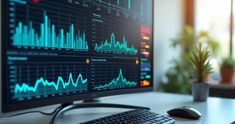
Before having a system like DROME, whenever I worked with data, it was common to see extensive tables and reports that nobody could really understand. Real-time monitoring changed that scenario, especially in environments dealing with sensitive inputs. Real-time graphs make visible what, for a long time, remained hidden in monthly reports and complicated spreadsheets.
Today, I can identify temperature deviations that could compromise medications or food in just minutes.
A graph doesn't lie. It tells a clear story without detours.
The main types of monitoring graphs
In the world of IoT and SaaS monitoring, as DROME offers, the main models are:
- Line graph: shows the evolution of a variable (temperature, for example) over time.
- Bar graph: ideal for comparing different sensors or environments in a period.
- Dynamic table: aggregates events (such as door-open alerts) at specific intervals.
But it's the line graph, the one that moves almost like a "pulse" of the environment, that reveals the most information. In DROME, I find graphs with quick filters, intuitive navigation, and visual alerts, which makes a huge difference when you need to act fast.
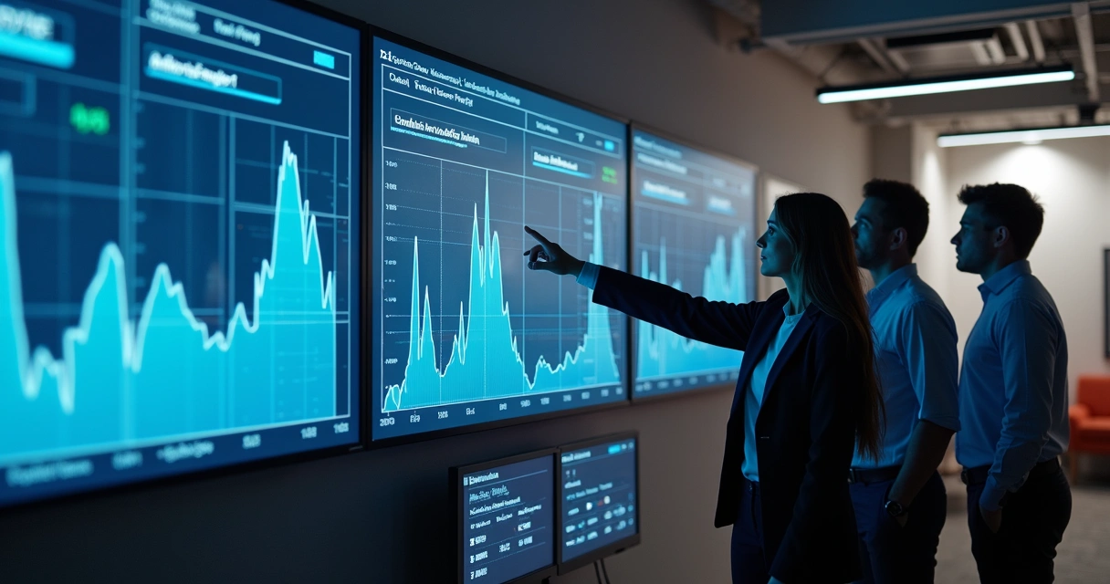
How do I start interpreting a graph?
At first, I'll admit, doubt hits when you see so many lines or red peaks flashing. The secret is always to follow this order:
- Identify what's being monitored: it can be temperature, humidity, movement, or another parameter. In DROME, it's easy because the graph header already shows this.
- Observe the time interval: try to understand if the view is by minutes, hours, or days. A rapid variation usually indicates a one-time event.
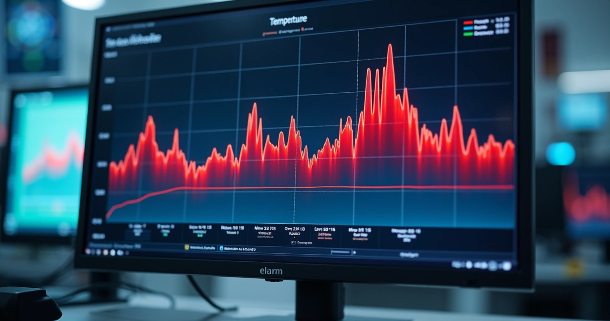
- See the critical limits: serious platforms show reference lines; in DROME, they are colored bands indicating whether the environment is safe or not.
- Look for patterns or anomalies: a stable graph suggests everything is fine. Spikes or drops may indicate equipment failures, open doors, or power outages.
- Validate with alerts: if there are warning triggers, check if they became visible at critical points on the graph.
I always avoid drawing conclusions by looking at just one isolated alert. The context of the graph is fundamental.
In the article on waste reduction in restaurants, there are good examples of graphs that facilitate this analytical view.
The role of visual alerts and reference bands
Something that always made a difference for me, especially during audits, is knowing where the risk is. Platforms like DROME use colors and icons, such as orange or red, to show that a parameter exceeded the limit. In practice, this visual highlight is what allows you to act before losing an entire batch of vaccines or food.
Some competitors promise customization, but often leave the visualization confusing, with overlapping graphs and poor contrast. In DROME, I've always appreciated the clarity. It's intuitive to distinguish historical data from current alerts without needing to "hunt" for information in complex screens. For me, that weighs when choosing a tool.
Understanding noise, fluctuations, and trends
Another important point: not every spike signals a problem. Graphs from controlled environments show natural noise, resulting from compressor cycles or quick door openings. What I look for are consistent and repeated changes, especially those that deviate from historical averages.
If I see a constant upward temperature trend, I know it's worth investigating whether there's equipment wear or sensor calibration issues. In another article, in the practical guide to sensor calibration, I bring important tips to ensure the quality of monitored data.
How to identify a real alert from a false one?
I've come across graphs that looked alarming but were just noise due to poor sensor calibration or passing events, like that end-of-shift cleaning. In DROME, the artificial intelligence system learns the environment's pattern, distinguishes normal noise from real threats, and minimizes the chance of false alarms. Other systems try to do the same, but with less precision and without direct user feedback.
So, whenever I see a spike or drop, I look for:
- Checking in the system if there's a history of similar events on that same day or time
- Verifying if a triggered alert was accompanied by a recorded action (such as door opening or maintenance)
- Distinguishing repeated events from one-time situations
In my experience, it's this process that prevents rushed analyses and hasty decisions.
How does predictive analysis appear in graphs?
A new generation of monitoring systems, like DROME, includes predictive analysis resources.
It not only shows what has already happened but points to what may happen in the coming hours or days.
I often see graphs with shaded areas indicating projections of future temperature rise or fall, allowing technical teams or those responsible for inputs to act preventively. This dramatically reduces losses and audit issues. And speaking of audits, DROME speeds up the issuance of detailed reports with graphs as evidence—less time wasted trying to justify deviations later.
Reports, history, and long-term value
Interpreting monitoring graphs is useful not just in real time. Access to history, often spanning months or years, allows you to identify seasonal trends, equipment aging, and even improve internal processes.
I emphasize: a monitoring system is only reliable when it allows easy access to history and offers understandable reports for everyone involved. In DROME, all these resources come integrated, with the ability to export data for audits, as I explained in recent experiences related to pharmaceutical management.
Why trust solutions like DROME?
Over time, I've seen competitor systems that stopped working when needed most, confusing interfaces, lack of support in critical alerts, or slowness in sending warnings. DROME, on the other hand, stands out for quick integration, clean interface, and agile support. Additionally, the AI and predictive analysis really work—they're not mere "marketing ornaments," which unfortunately I still see in other market options.
For those dealing with food, medications, vaccines, and other sensitive inputs, the difference lies in details: understandable graphs, easily accessible history, detailed reports, and reliable support. Other suppliers may offer parts of these solutions, but rarely deliver the complete DROME experience.
If you want to delve deeper into how different environments and sectors can benefit from monitoring, I recommend the monitoring category on our blog, where I bring real situations I've experienced and seen other professionals face.
And when does monitoring make the difference?
Next time you look at a real-time monitoring graph, remember that it's more than lines and numbers. It's the opportunity to anticipate errors, avoid losses, and ensure the quality of products that reach people. In my case, I've already seen losses prevented thanks to careful reading of a graph and quick action within minutes.
If you're ready to transform how your company manages sensitive data and leave worries about losses behind, I invite you to learn more about DROME. Access our platform now, run the tests, and change the way you interpret and act on what really matters: safety, results, and the peace of mind that comes from intelligent and transparent monitoring.